Quiz Conception (inactif pour l'automne 2021, consultez LOG2420 sur Moodle)
- Identifiez, décrivez et justifiez comment et pourquoi vous appliqueriez
les trois méthodes énoncées ci-dessous pour un projet
de conception interface pour l'enregistrement d'émissions télé sur ordinateur pour bien préciser les
exigences des utilisateurs :
- Analyse de la tâche
- Groupe de discussion
- Sondage
- Votre association d'étudiants vous mandate pour refaire l'interface de leur site. On pense, par exemple, à améliorer le service de vente et d'achats de livres usagés. Quelles activités leur proposeriez-vous pour les aider à redéfinir les services du site et l'interface. Justifiez votre réponse.
- Luc et Jeanne ne s'accordent pas quant à l'avantage de fournir un "défaire" (undo) généralisé pour leur application de calendrier électronique. Cette fonction serait très lourde à supporter pour toutes les actions possible. Luc affirme que, comme le principal avantage est de permettre de préserver le travail de l'utilisateur, il serait préférable de ne l'offrir que pour quelques fonctions critiques seulement. Jeanne affirme au contraire que si on doit l'offrir, il faut l'offrir partout pour être consistant, ou ne pas l'offrir et simplement avoir des confirmation pour les actions critiques. Si c'est trop coûteux, elle propose de demander une confirmation pour chaque action critique. Discutez du point de vue de chacun et de ce que vous proposeriez.
- Lors de la conception d'une interface usager, est-il préférable d'utiliser un contraste de couleurs ou un contraste d'intensité? Pourquoi?
- Expliquez le principe de l'autonomie
- Décrivez et expliquez les information que l'on cherche à colliger à travers l'inspection cognitive, ainsi que les questions spécifiques à poser.
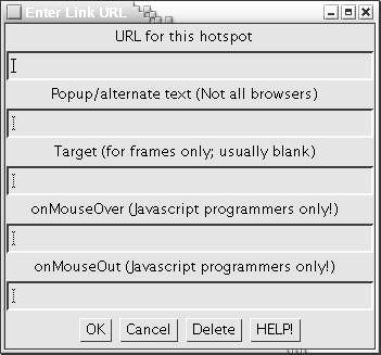
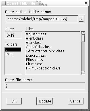
- Les fenêtres ici-bas sont tirées de l'application MapEdit.
- Identifiez un élément de charge cognitive pour chaque fenêtre
- Laquelle des deux fenêtres de Mapedit suivantes comporte la charge cognitive la plus importante ?
- Proposez deux éléments pour améliorer l'ergonomie d'une ou des deux fenêtres.
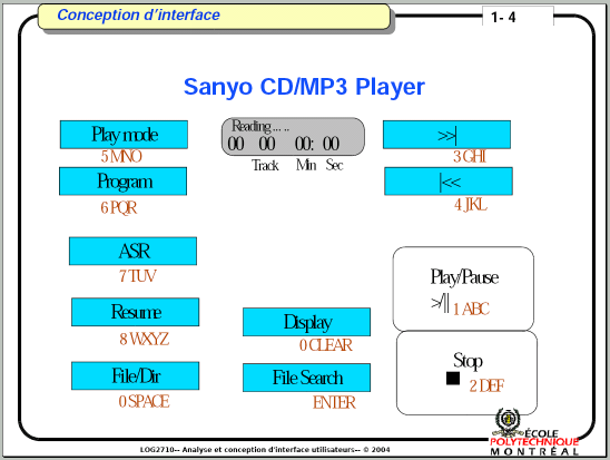
- Nous avons vu à la première séance de cours un appareil qui affichait de grave problèmes
de conception d'interface, le baladeur de Sanyo dont l'interface est reproduite
schématiquement ci-dessous.
- Expliquez quels sont les principaux principes ergonomiques de conception qui font défaut à cette interface
- Expliquez, selon vous, les principaux principes de développement centré-utilisateur qui ont vraisemblablement fait défaut pour la conception de l'interface
- Voici quelques règles de Smith et Mosier. Pour chacune, faites le lien avec des heuristiques de Bastien et Scapin.
- 1.0/26 Minimal Shift Keying
Design data entry transactions to minimize the need for shift keying.
Comment: Shift keying can be considered a form of double keying, which imposes a demand for extra user attention. Keyboard designers should put frequently used characters where they can be easily keyed. Conversely, software designers should avoid frequent use of characters requiring shift keying.
- 1.1/1 Distinctive Cursor
For position designation on an electronic display, provide a movable cursor with distinctive visual features (shape, blink, etc.). Exception: When position designation involves only selection among displayed alternatives, highlighting selected items might be used instead of a separately displayed cursor.
Comment: When choosing a cursor shape, consider the general content of the display. For instance, an underscore cursor would be difficult to see on a display of underscored text, or on a graphical display containing many other lines.
Comment: If the cursor is changed to denote different functions (e.g., to signal deletion rather than entry), then each different cursor should be distinguishable from the others. Comment: If multiple cursors are used on the same display (e.g., one for alphanumeric entry and one for line drawing), then each cursor should be distinguishable from the others
- 1.3/24 Storing Frequently Used Text
Allow users to label and store frequently used text segments, and later to recall (copy into current text) stored segments identified by their assigned labels.
Example: Much text processing involves repetitive elements specific to different applications, such as signature blocks, technical terms, long names, formulas or equations.
- 1.6/4 Confirming Cursor Position
For most graphics data entry, pointing should be a dual action, first positioning a cursor at a desired position, and then confirming that position to the computer.
Exception: An exception to this recommendation would be the freehand drawing of continuous lines ("path specification"), where a computer must store and display a series of cursor positions as they are input by the user; when the user initiates such a line-drawing sequence, a new data point might be recorded automatically whenever the cursor has been moved a certain distance (e.g., 1 mm) or when a certain time has elapsed (e.g., 0.5 s). Comment: During graphics data entry, a cursor will almost always be somewhere on the display, but not necessarily at a location intended by the user. In effect, a user needs some way to move the cursor around and some separate action to signal the computer when its position should be recorded. Comment: An interesting case of position confirmation is "rubberbanding", which is a technique to aid line drawing. With rubberbanding, a user can designate the starting point for a line, then move the cursor to various possible end points while the computer continuously shows the line that would result if that end point were confirmed by the user.
- 1.6/12 Displaying Current Attributes
During graphic data entry/editing, display the selected attributes that will affect current actions for ready reference by the user.
Example: When graphic attributes -- plotting symbols, character size, line type, color, etc. -- are chosen from displayed menus, it might suffice to highlight the currently selected menu options; alternatively, current selections might be shown in some sort of "reminder" window.
Example: A few attributes might be shown by the displayed cursor, i.e., by changing cursor shape, size or color depending upon current attribute selections.
Example: If rubberbanding is provided to aid line drawing, then that process itself would show the currently selected line type. Comment: Users may forget what options have been chosen. Displayed reminders will be particularly important in situations where the consequences of a mistaken user action are difficult to reverse, e.g., where it may be hard to erase a wrongly drawn line. Comment: In some applications, display cues may not be adequate to convey attribute information completely. There may not be sufficient room on the display. Or the attributes may derive from underlying models whose characteristics are too complex for simple display representation. In such cases, users should be able to request auxiliary display of such information to determine the operative context for current actions.
- 1.0/26 Minimal Shift Keying